

Online Student Portal
$30k/yr reduction in cost by improving application submission accuracy
The Online Student Portal is a web platform for applicants to submit undergraduate admissions application. The admission decisions are made based solely on the information submitted through it. Being the only opportunity for the applicants to impress the admissions officers, it is crucial to complete the application accurately and to the best of their ability.
Client
Faculty of Applied Science & Engg., University of Toronto
Role
UX/UI Designer
Team
SME - Assistant Registrar, Admission
Development Manager
Duration
6 weeks
Problem
How might we help candidates fill the admission forms accurately and confidently?
The complex and cluttered user interface of the current Online Student Portal was resulting in applications submitted with inaccurate and/or missing information. The Admissions Office received several phone and chat queries each day related to admission forms. The admission officers spent a significant amount of time correcting the forms and following up with candidates.
Goal
Accuracy rate
Applications submitted with correct & complete information
Time Saved
703hr
15 minutes saved per application
Result
30%
Increase in the accuracy rate
Business Impact
$30k/yr
Cost reduction

Design Process
Overview of the project phases

Discover
Understanding the domain - current admission lifecycle
To truly understand the admissions process and how to improve it I started with a deep dive into the available documentation. From there, I took it upon myself to explore the portal independently and set up meetings with experienced admission officers to gain even more insight. To get a handle on the project priorities I conducted interviews with stakeholders to better understand their goals and expectations.
All of this research helped me to identify the user flows and pain points that the admissions office was currently experiencing. Armed with that knowledge I was ready jump into the next steps.
03
Documentation reviewed
02
Walk-through sessions
02
Stakeholder interviews

Discover
Understanding the users
High-school students are the primary users of the Online Student Portal. They are often assisted by older siblings, friends, parents, or teachers to complete the admission application.
Admission Officers working the the Admissions Office are the secondary users of the portal. They are responsible for processing the applications and making admission decisions. They respond to applicant queries through call or chat and often assist them in completing the application.


Discover
Users Insights
A big challenge in this project was the inability to work with primary users (Admission Applicants) due to lack of time and resources. Instead I interviewed three secondary users (Admission Officers) who regularly assist applicants in accurately completing the applications and answer queries over chat, phone, and email. Below are top three queries that the Admission Officers resolve on a daily basis.
1. Confusion regarding submitting application sections without data
All sections of the admission application have to be submitted, some sections such as extracurricular activities can be submitted even without data. The current interface does not clearly explain such scenarios to the applicant.
2. Hidden rules for selection of engineering programs
The applicants must select a minimum of 2 and a maximum of 4 engineering programs in the order of their preference. Some of the programs can only be selected as the first or second preference. But that information is not provided on the UI leading to a lot of confusion and change in the order of preference after submission of the application.
3. Difficulty in identifying pending documents
In the current UI, the list of required documents in split across multiple screens - Dashboard, Document Upload and Academic Profile. It causes a lot of confusion for the applicants and the Admission Officers need to follow up with applicants individually for gathering the necessary documents.
Discover
Web analytics data
>90%
Users view on desktop
39%
Users are not native English speakers
53%
Users are from outside of Canada
Discover
Learnings from heuristic evaluation
1. Lack of visibility of application status and unclear next steps
With information scattered in several places, the old portal made it difficult to determine application status and pending items at a glance. It gave no guidance or indication of the correct order of steps to complete the application.

2. Critical information lost in the noise and out of context instructions
Large block of unformatted instructions make it impossible to scan. Critical information necessary to accurately fill the application were not highlighted. Moreover, some instructions were out of context.

3. Complicated and error prone interaction patterns
Each screen had many clickable elements and no clear visual cues to indicate the correct next step. Some application sections had to be filled in a specific way, but no instructions or guidance was available to help applicants take the right steps.

4. Lack of visual alignment and consistency in UI elements
There was no apparent balance or alignment in the UI elements. Page layouts lacked both structure and a coherent visual language.

5. Web accessibility problems
Online Student Portal failed to comply with several WCAG compliances, especially colour contrast.

6. High reading level of content
The recommended reading level as per the industry standard is level 6 to 8, whereas the text content of the Online Student Portal was around grade 11. This was especially concerning since 39% of users are non-native English speakers.

Define
Defining the design strategy and plan
Based on the project timeline, I suggested the immediate redesign plan that I could achieve in the available time and proposed long-term design strategy for the team to follow for taking the user experience to the next level.
Design focus

User Interface
-
Bring visual hierarchy, alignment and consistency
-
WCAG compliance - font, colour and contrast

Interaction Patterns
-
Reduce probability of making mistakes
-
Provide guidance for possible next action

Information
-
Provide clarity in application status
-
Transparency in use of application data
Long-term design strategy

End-to-end experience
-
Guided step-by-step application completion process
-
Integrated email communication

Modularization
-
Separating applicant account information, dashboard, admission application workflow, and additional information/resources

Content Strategy
-
Content audit
-
Vocabulary development
-
Reading level suitable for international non-english speaking audience
Design
User Interface - bringing consistency and clarity
1. Defining grid system and page layouts
As the first step to bring consistency in the UI, I introduced the concept of a grid-system to the team and defined the standard layouts to be used to ensure clean interface and proper alignment of elements.

2. Creating a design system
To address lack of visual hierarchy of content and inconsistency in UI elements, I created a design system. The new font styles and colours ensure WCAG compliance.

Design
Interaction patterns - reducing errors & providing guidance
1. Logic based states of UI components
I introduced multiple states for UI components based on business logic to indicate what data has been submitted and what actions are possibles.

2. Explicit actions for accountability
All sections of the admission application must be submitted even if there is no relevant data to provide. I brought in explicit actions to ensure that applicants are aware when they are submitting any sections without data.
Design
Information - bringing clarity and transparency
1. Clearly visible application status and pending items
I introduced a dedicated application status block on the dashboard along with summary of the various application sections and pending documents.

2. Bringing transparency in admission decision process
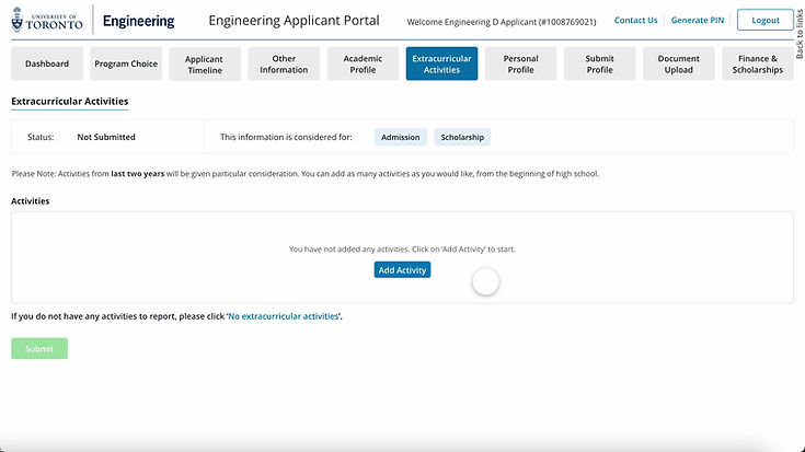
The data submitted in the application is used for making two decisions - admission and scholarship. Whereas some data does not affect the decisions at all. But no advice regarding this was given to applicants.
By bringing transparency in this regards supports applicants to better fill the application.

Final Designs
Dashboard
The redesigned dashboard clearly shows the application status and provides user immediate action items

Standardized application sections
Each application section now follows a standard layout indicating status and providing transparency on how the data from that section is used for making decision.

Reflections
Project Limitations
01 No access to primary users
Due to the strict timeline and limited resources it was not possible to conduct research or testing with the primary users - high school students. Instead, I conducted research and usability testing with secondary users - admission officers who interact with applicants on a daily basis and assist them correctly filling the admission application.
02 Focus on desktop
Since 90% of our users view the portal on desktop, we focused on improving the experience for them. But going forward it is necessary to cater the other 10% - mobile and tablet users.
Reflections
Learnings
01 Keeping stakeholders in loop
I established regular meetings with stakeholders to update them on the project's progress and solicit their opinions on the design. It assisted in setting the pace, providing frequent updates and continuous validation of the direction the redesign was taking.
02 Being the UX evangelist
The Admissions Office was collaborating with a UX designer for the first time during this project. Therefore, a key component of my job was to create a strong foundation, raise awareness, and empower the team to take the user-centric approach forward.