

Physical activities in a week
How much physical activity do I get?
How much physical activity do I get in a week? Are there any patterns to when I am active in the day?
A Dear-Data inspired assignment for Information Workshop: Best Practices in Data Visualization taught by Bianca DiPietro. For a week I collected data on physical activity:
-
Time of day
-
Duration
-
Intensity
-
Location
-
Social setup
The assignment required that we create the data visualization to fit on the front of a postcard in landscape format, either 5x7” or 4x6” with no text. And a description of how to read the visualization on the back of the postcard.
Visualization
Click on the image to see full size.
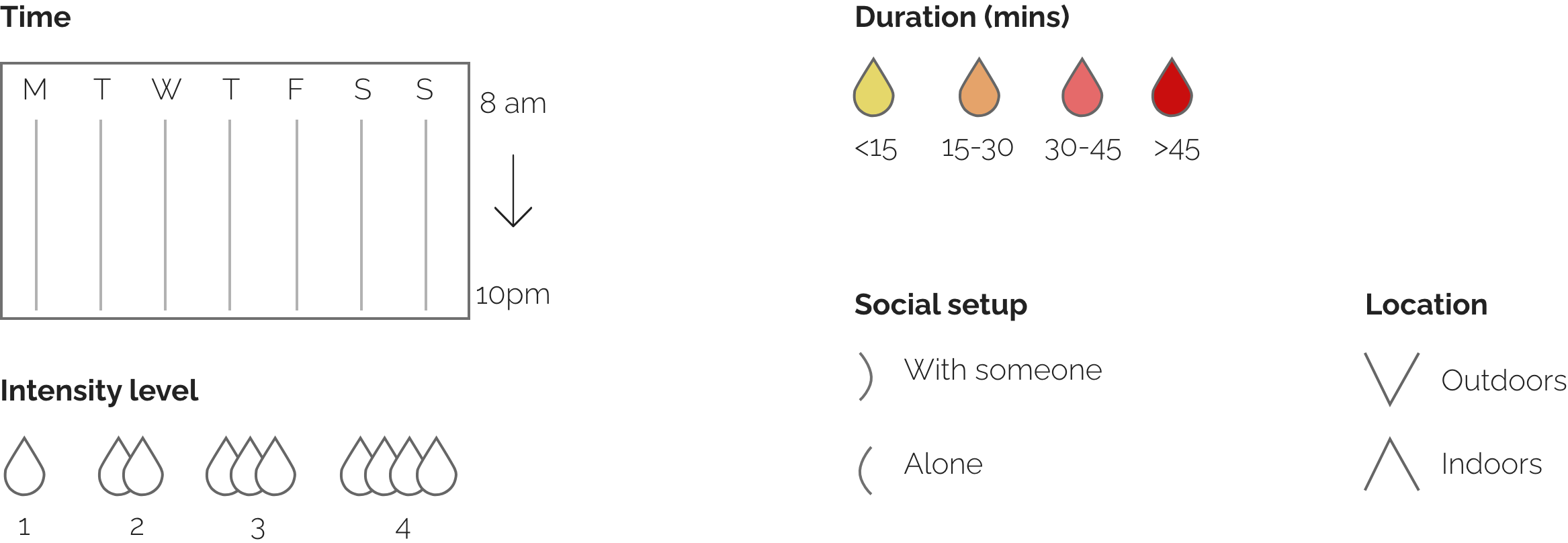
How to read it?
Click on image to see full size.
Areas of improvement and learnings
Data visualization does not have be complicated
We don't always have to create complex visualizations. Simple temporal presentation is a good place to start to look for patterns in data.
Try multiple encoding methods
In this visualization, it would have made more sense to swap the encoding for intensity and duration. Color is more commonly associated with intensity.