

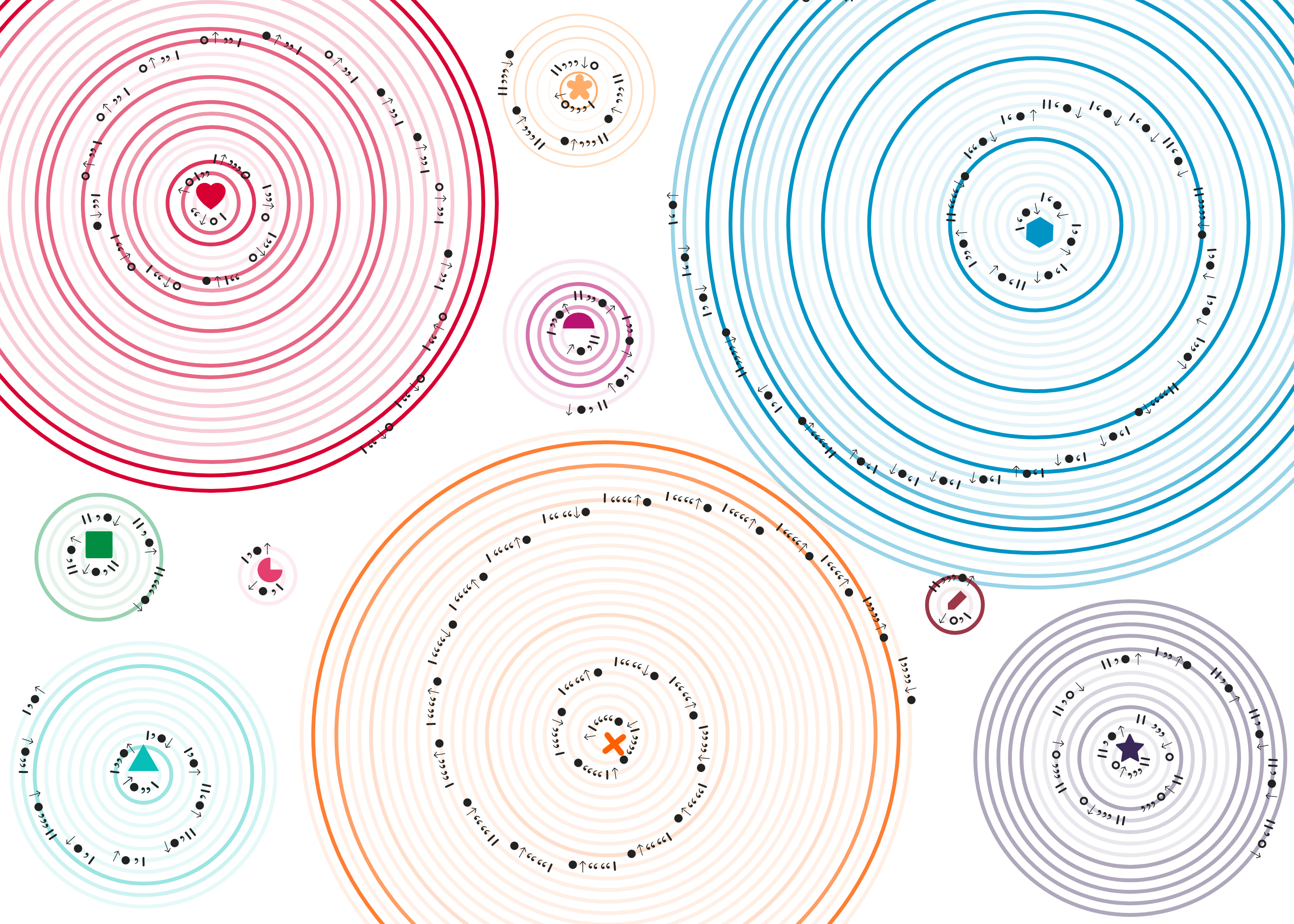
A week of conversations
Who do I talk to?
Ever wonder how much time you spend talking to people. And who do you talk the most to?
A Dear-Data inspired assignment for Information Workshop: Best Practices in Data Visualization taught by Bianca DiPietro. For a week I collected data on all the conversations I had:
-
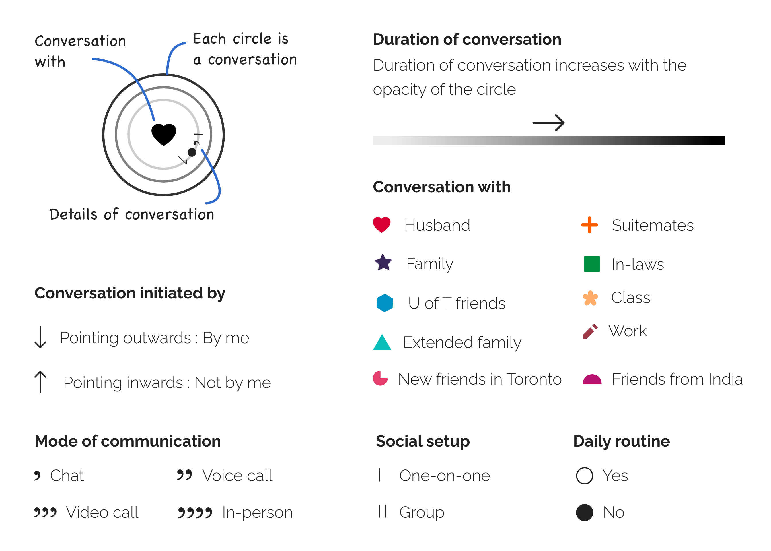
Whom I spoke with
-
Mode of conversation
-
Duration
-
Social setup
-
Who initiated the conversation
-
If the conversation was part of my daily routine.
The assignment required that we create the data visualization to fit on the front of a postcard in landscape format, either 5x7” or 4x6” with no text. And a description of how to read the visualization on the back of the postcard.
Visualization
Click on the image to see full size.
How to read it?
Click on the image to see full size.
Areas of improvement and learnings
A story is hidden in all data
Everything we do every moment is potentially data that can be recorded and analyzed to tell a story. We just have to look at it through the right lens and ask questions that make sense in the context.
Context matters
Looking closely at this data visualization, one can tell that most of my conversations are not face-to-face. It might seem surprising until I add in the context of the pandemic where we are all holed up indoors. Another missing aspect here is a sense of duration. The variation in color opacity only says whether a conversation was long or short. But doesn't say how long.